ellie brown media
Friday, 10 May 2013
Photo Project evaluation
https://docs.google.com/document/d/18_YOB35oREPADnRxhxTKUNHr6_62NMRM6YZwVX1CjUo/edit?usp=sharing
Sunday, 28 April 2013
Friday, 26 April 2013
Friday, 22 March 2013
Edited photos
 |
| This is the photo before I edited it. |
 |
| This is the photo after I have edited it, I have cropped it and changed the color scheme to black and white |
 |
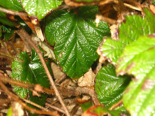
| This is the photo before I edited it. |
 |
| This is the photo after I have edited it, I have cropped it, changed the color balance and blurred the background so that the focus is on one leaf. |
Friday, 1 March 2013
Steps to uploading
This is the process of how to upload a photo onto the computer, back it up using a memory stick, and then upload it onto your blog or other social network sites.
Wednesday, 27 February 2013
Monday, 18 February 2013
We took this photo in a group because the lines of the water falling down match very well together with the vertical lines of the water and the horizontal of the grate.
I chose this photo from our group photos because it has alot of patterns in the photo, continuous patterns and different lines that all work very well together.
I have chosen this photo from our group photos because the leaves have good textures and different patterns along the leaf.
I chose this photo from our group photos because it has alot of patterns in the photo, continuous patterns and different lines that all work very well together.
I have chosen this photo from our group photos because the leaves have good textures and different patterns along the leaf.
We took this photo in our group because the flowers are bright colored.
Friday, 8 February 2013
I have edited the bad framed photo in photoshop. I have selected the area around the faces and inverted it, and then blurred the background out. I didn't edit the colors of the picture or the contrast. i didn't crop the photo but having blurred the background out the photo now looks like a better framed photo.
Wednesday, 6 February 2013
Friday, 1 February 2013
Can you make a photo look interesting?
This is a bad photo because it is now framed properly, and is not focusing on the people very much, the colors are dull and dark. I am going to edit it to make it a good framed photo.
Monday, 28 January 2013
Friday, 25 January 2013
Monday, 14 January 2013
Friday, 11 January 2013
Year 11 Photography Unit
Hi I am Ellie Brown and I am studying OCR Media and have done two previous units to this.
I have done a CD Cover and magazine cover and filming.
In this Unit I am doing photography.
I have done a CD Cover and magazine cover and filming.
In this Unit I am doing photography.
Subscribe to:
Comments (Atom)


